« InterKey Keyboard | Main | Full Facebook on your Mobile Phone with Friend Mobilizer »
July 14, 2008
Make Space for Winterface
Ho hum, you say, not another shell to supplant the Today screen. I have long been an advocate of having easy, instant access to everything in and about my device from the opening screen. Vito Technology, one of the leading Windows Mobile developers, has just added an exciting new workhorse to its stable of finger-friendly iPhone-like applications. It’s called Winterface and functions as a program launcher, system monitor, and task manager.
 Winterface is a sort of farfetched name for ”Windows Interface” that brings to my mind an Eskimo with icicles hanging from eyebrows. Nevertheless, it is a masterful piece of engineering that puts just about anything you want within a finger stroke or two from PIM info to system info to applications and utilities.
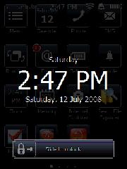
The way it is set up is that when you turn on your machine, a lock screen will appear that displays the day, time, and date. To open the program, slide the padlock to the right. Alternatively you can use an arcing left to right gesture across the screen. This gesture will take you to the opening page of Winterface from anywhere within any application, which is a handy feature. To navigate back and forth between pages, use a finger gesture in the direction you want to go.
When sliding between pages with your finger, you have to be careful not to linger on an icon because you will activate it. I suppose that’s why there is always a black spot on the lower right corner of every screen. Use this area for finger scrolling.
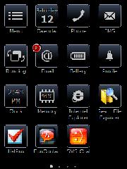
The opening page of Winterface is a somber black screen with the default white icons in 15 bluish bordered boxes. These boxes contain what may be considered the most vital functions that a user would probably want to access such as calendar, phone, SMS, running programs, email, battery status, profile, clock, memory, and Internet Explorer.
 A Menu icon in the upper right corner allows you to change the screen content from your loaded applications, settings utilities, and contacts. You can change the onboard language as well here. There is a Help button, but there was not no help loaded on my copy of the program. Perhaps that’s coming. To make an application appear, simply scroll through the list with finger strokes until you get to the one you want. Tap it and then tap the check mark at the bottom right, and it will appear on the screen. I appreciate that you can tap as many as you wish without having to go back and forth each time.
To change the position and organization of the icons on the screen, tap and hold anywhere on the screen. Suddenly, all the icons will begin to jiggle as if they were on a bed of Jello. Drag an icon where you want it and drop it. To delete it, tap on the red X in the upper corner. To stop the earthquake motion, tap on the navigation/joystick button.
Another nice feature is that when you have messages of any kind, that application’s button will display the number of unviewed messages.
I don’t know if the number of pages you can have is infinite for I grew weary of placing icons after filling up six pages, which is certainly adequate for most users. A series of white dots appears at the bottom of the screen to indicate how many pages there are and the dot corresponding to the page you’re on lights up. I thought you might be able to tap on a dot, and it would take you to that page. But that’s not the case--perhaps in future editions.
I wish that it were possible to access the main menu from every page and that it were possible to place new icons on the current page instead of having to drag them around across pages. Perhaps this will be possible in future editions.
While it is certainly easy to pull up your contacts, I thought it would be nice if Winterface had a favorites contact module. However, you can easily create your own by placing your favorites on a designated page that you can readily glide to with finger strokes.
Winterface is also a task manager. To access this function, tap on the Running icon. It will display all open applications. To open that application, tap on its icon. To close it tap on the red circle.
I must say that I was disappointed at the paucity of functions offered in the task manager. For instance, there are some task managers that have a dozen or more functions such as close all, close all but active, soft reset, rotate screen, Today screen, and more.
Another surprise was the inability to create folders where you can place related items. For instance, it would be useful to have a game folder or a folder of dictionaries. I suppose that the work around is that you could create a separate page with all your dictionaries on it. But this involves more navigation.
It would also be great if you could generate a folder containing your favorite files for easy access and perhaps subfolders. Currently, it is not even possible to place individual files on the screen pages.
While talking on the phone, my unit started going off like a hand grenade with three different appointment reminders. I had a heck of a time getting out of Winterface to dismiss them. I would like to see an easy way to get to reminders and notifications built into the next version of the program. That information should be available on the front page.
Finally, I’m not sure why Vito insists on this gloomy new black look. I suppose the color or lack of color is in keeping with the name Winterface though. I think Vito thinks it is more businesslike, for it is a unifying theme pervading all of the new finger-friendly applications. Lighten up Vito. Life’s short. Let’s have some fun with a little color. Who watches black and white TV anymore? Anyway, it’s nice to be able to see the colors of your familiar application icons on the pages following the first page.
Other than those few items on my wish list, I found Winterface to be an easy to use, valuable program that gives vastly increased functionality to your handheld touch screen device.
Try it free for 15 days. I can be yours for $19.95 from www.iwindowsmobile.com.
Posted by conradb212 at July 14, 2008 05:14 PM
