« June 2008 | Main | October 2008 »
July 28, 2008
The Palm Treo 800w
It has been quite some time since Palm has come to the table with a new Windows Mobile Professional device: enter the Treo 800W, WM 6.1. At first glance it doesn’t appear all that different than its predecessor, the Treo 750W. But there are some subtle and not so subtle differences.
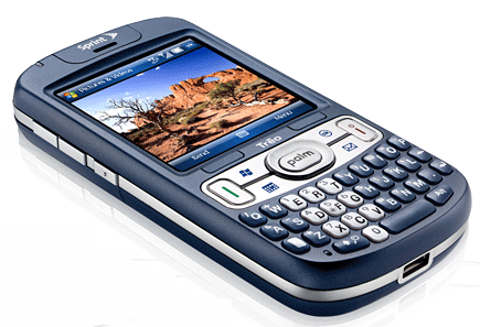 The new Treo is much thinner, the screen is the same size, there is a Sprint logo on the top, there are two new hardware buttons—one for mail, one for calendar, the keyboard keys have a new look and feel-they are flat instead of rounded and therefore seem to have less definition.
A quick glance at the bottom made me quiver with delight for I thought that at last Palm has gotten rid of its goofy, proprietary connector and opted for the more universal mini USB connector. But my hopes were quickly dashed upon closer inspection because it was what they call a micro-USB connector, which is far from standard. This means that you can’t use the old Treo cradles, and you have to pack yet another cable and charger when traveling—not a good thing.
Where was the audio output jack? I hoped maybe they would offer a standard 3.5 jack instead of the 2.5 mm jack found on other Treos, but no such luck. Instead, you must use the micro-USB port for audio output. How ill-conceived is that? You cannot charge your unit while listening to audio output. You cannot connect to standard external speakers. You can’t even talk on the phone while charging and using the headset earbuds that come in the box.
To make matters even worse, the micro USB cable supplied in the box is only good for syncing, not charging. So, you are actually draining battery power while syncing.
And the sacrilege compounds when you realize that you cannot charge the device while using it for navigation in the car using the sync cable. I could not even recharge the 800w with my auxiliary battery charger, which was another disappointment.
The micro-USB port is a disaster that could discourage power users from taking a second look at this device. This unfortunate configuration needs to be changed if the Treo 800W is to be taken seriously as an enterprise device.
If you are a faithful Treo packer looking for a smooth transitional upgrade, fergetaboutit. You will have to abandon all your peripherals and acquire new ones. Even the battery is different, which I suppose is expectable to accommodate the slimmer design. But what am I going to do with all my old spare Treo batteries? Lift up the battery, and you will not find a SIM card slot because there isn’t one, which is another shame.
Amazingly, you will not find a reset button recessed anywhere, not even hidden behind the expansion card slot cover. The only way to reset this machine is to remove the battery—bother. Well, maybe it will prove so stable that you will never have to reset it. Not.
If you were expecting to slip your old mini-SD card from your Treo 750 into the expansion slot of the new 800W, you can forget about that too because it uses a micro-SD card instead.
Up top, we have a stylus silo. The stylus is black nylon and extremely flexible. I do not like this flimsy stylus. You could tie some fish line to it and use as a fly rod. I’ve always appreciated Palm’s sound off/on switch, and it’s still there on the 800W along with the addition of a handy Wi-Fi on/off switch, both on the top panel.
Yes, I said Wi-Fi. This is the first Palm to offer Wi-Fi, a long time in coming and a woefully neglected feature in previous models. Hooray for Palm!
Now you can use your Treo as a laptop Modem connecting to the Internet via a phone network or a Wi-Fi connection. There’s even a software application that comes with it for this purpose. Stellar move, Palm. Of course, you cannot charge the unit via USB cable during this process, which is not good.
On the back, you will find a speaker, a 2.0 Mpx camera lens, and a self-portrait mirror. There is also what the manual describes as an external port that I assume is for an external GPS antenna.
Here’s another great feature of this phone; it comes with built-in GPS—sort of. Sprint wants you to subscribe to their navigation system for $9.95 a month. As you will begin to figure out, this is not the only opportunity to spend more money with Sprint on this phone.
The GPS system uses Sprint cell towers for triangulation as well as satellite communication. It will work with Google Maps for navigation, and you can install your own navigation program if you don’t want to pay Sprint’s monthly fee. You can use the handy GPS panel on the Today screen to find points of interest and directions--a nice feature.
On the left side are two volume control buttons and a button that turns on the voice recorder by default, but you can program it to anything you want. Just hold the button in to start recording, which is a handy feature. Note that in the Settings area, you can assign dual functions to hardware buttons.
On the right side, under a cover, you will find the micro-SD card. This is also where the InfraRed port is located. I wish more people took advantage of IR, for it is very useful for beaming data from device to device. I find that most people don’t even know about it or how to use it—too bad. Check it out. Unfortunately, I notice that some new devices don’t even have IR anymore. What a shame.
In the box
What comes in the box is bare bones. You get a printed manual, a CD with some applications (some free, some for a fee), a sync cable, an AC charger, and a set of earbuds. There is no extra stylus, no case, no cradle, no car charger, no GPS car mount, no extra battery, and no storage card. In fact, most of these items are not even available yet in the Palm store. So, this unit is a bit ahead of its time.
The 800W comes well-endowed with a rich complement of software:
 Active Sync
Calculator
Camera
File Explorer
Games
Aces Texas Hold ‘em Limit
Astraware Sodoku
Bubble Breaker
Solitare
Get Pocket Express
Instant Messaging
Internet Explorer
Internet Sharing
LiveSearch
Maps
Messaging
My Treo
Notes
Office Mobile
Excel Mobile
OneNote Mobile
PowerPoint Mobile
Word Mobile
PDF Viewer
Pictures & Videos
Quick Tour
Search
Software Store
Sounds
Sprint Navigation
Sprint TV
Sprite Backup
Task Manager
Tasks
Voice Command
Windows Live
Windows Media
Notice in the lineup that Sprint offers users several opportunities to spend money with their software store right in the program lineup, navigation, and TV. The store is where you go to spend money on applications, games, ringtones, screen savers, and subscribe to Pocket Express extras. But, at this store you cannot try before you buy!
I was only able to get a couple of free channels to work and never got beyond “loading” for most of the channels I tried. While I think this is a nice feature, it could get expensive. I prefer to use my faithful Slingplayer and watch a full lineup of channels on my home satellite TV and DRV recordings, thank you.
Whoops, I just installed SlingPlayer, and while it works, it only displays a picture of about 1.25 x .75 inches, not at all satisfactory. SlingMedia does not yet support the 320 x 320 screen--I hope they will soon.
I appreciate having the task manager up front and not having to do a tap dance to get to it. I was surprised to see a couple of new games in the stable. The addition of OneNote Mobile was another pleasant surprise for productivity. Instant messaging runs a program that installs AIM.
Windows Live Messenger, and YahooMessenger, but not Google Talk. Voice Command is always a welcome application.
Yes, I know that it has a square screen, and it may seem senseless to some people, Palm people in particular, to allow the screen to rotate as it does in normal WM devices. Screen rotation is not an option with the Treo. But, I consider this a negative factor. Sometimes it’s nice to be able to rotate the screen for reading eBooks, playing games, and for watching movies.
On the CD that comes in the box, you will have the opportunity to download three more applications: Astraware’s Bejeweled 2, Mobimate’s WorldMate, and Sprite Backup. WorldMate is yet another chance to spend money because it will cost you $75 to activate the professional version.
Specifications
- Platform: WM 6.1 Professional
- Display: 320 x 320 transflective color TFT touchscreen
- Radio: Qualcomm MSM6800A chipset supporting EvDO Rev A
- Wi-Fi: 802.11 b/g
- GPS: Built-in GPS (standalone and assisted); Sprint Navigation; GPS powered local search, maps, and navigation from Today screen
- Bluetooth: version 2.0
- Memory: 256 MB (approx 1270 MB available user memory); 128 MB program memory
- Camera: 2.0 Mpx (1280 x 1024); 2x digital zoom and video capture
- Battery: Removable 1150 mAh lithium-ion; up to 4.5 hours talk time-200 hours standby
- Expansion: Micro-SD card—up to 8 GB supported
- Connector: Micro USB 2.0
- Dimensions: 2.28” W x 4.41: L x 0.73” D; 5.0 oz.
- System requirements: Windows XP; Windows Vista
Customer Support
In the past, I’ve always considered Palm customer support exemplary. However, I was disappointed to be connected and disconnected and reconnected with a call center in the Philippines where customer support has been outsourced. There were not only language problems but the technicians were not well trained. I can’t tell you how glad I was when I was connected to Sprint’s customer support center in Dallas, Texas, and to get a good old boy down home Texas accent that I could at least understand.
Sprint offers a variety of opportunities to pay additional fees with this phone. The best strategy is to get an all-inclusive, so-called unlimited usage plan that will cost about $99 a month. However, I have read recently that Sprint is starting to limit the unlimited plans. Pretty soon, using your phone may be like driving your car—unaffordable.
Conclusions
My first PDA was a Palm Pilot, but I couldn’t help switching over to Windows Mobile, and when Palm did the same I was delighted. I’ve had every one of the WM Treos now, and I’m a devoted fan. I like the look and the feel, and it just gets better. I like the innovative touches Palm puts on top of the WM system for greater functionality and ease of use. I particularly appreciate the full QWERTY keyboard and how you can run the whole operation with one hand while driving—just kidding. I am especially grateful for WI-Fi, GPS, and TV, all new features on the Treo 800w. The single, biggest problem is the goofy, non-standard connector that severally limits the unit’s functionality. It’s a keeper, but with some issues that I hope will be resolved the next time around.
Pros:
- One Touch Wi-Fi
- GPS
- TV
- Palm telephony enhancements
- One-handed operation
- Full QWERTY front-facing keyboard
- Wi-Fi power button
- Sound button
- 320 x 320 screen resolution
Con:
- Unconventional connector
- Limited battery life
- No SIM card
- No cradle for viewing, syncing, charging
- Cannot charge with sync cable
- Cannot charge while navigating in car w/sync cable rendering GPS of limited value
- Cannot charge while playing music
- Keys have a squishy, less defined feel, and typing is therefore less precise
- No 3.5 mm audio jack—cannot use with external speakers
- No reset button
- Cannot rotate screen
Posted by conradb212 at 07:02 PM | Comments (0)
Full Facebook on your Mobile Phone with Friend Mobilizer
Have you ever wished you could be notified automatically on your phone what’s happening on your Facebook site? Better yet, what if you could see what’s transpiring and be able to interact with Facebook on your phone just as you would on your desktop? A free application from Macrospecs, Inc. called FriendMobilizer makes this possible. It only works on Windows Mobile 6 and higher phones. But if you don’t have one, you should not consider anything less.
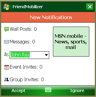 There is a Smartphone and Pocket PC version available or for touch screen and non-touch screen Windows Mobile devices.
After you register your phone, there are two options for downloading and installing the software. You can download a CAB file via synchronization with the desktop or you can do it over the air using your mobile device’s Web browser. I do not appreciate, however, that you are required to install it to main memory; you may not install it on an expansion card. I detest anything that hogs up my main memory. But, it’s only a 381K file.
After installation, the first time you use it you must login to your Facebook account. If you check the save this information box, you won’t have to do this again.
Click Login, and your Facebook notifications open on your handheld screen with the following key features available:
· All notifications are sent to your handheld screen
· You can set your status
· Approve friend requests
· View Group/Event invites
· Check wall posts
· Check inbox
· Send messages, pokes, and wall posts
· View friends’ status, timezone, all, photos, profile, and more
Basically, you get access to the entire Facebook experience on your mobile phone. To register your phone and to download this free software, go to http://faceofmobile.com. Follow the instructions, and you will have Facebook on your phone in no time.
Posted by conradb212 at 06:06 PM | Comments (0)
July 14, 2008
Make Space for Winterface
Ho hum, you say, not another shell to supplant the Today screen. I have long been an advocate of having easy, instant access to everything in and about my device from the opening screen. Vito Technology, one of the leading Windows Mobile developers, has just added an exciting new workhorse to its stable of finger-friendly iPhone-like applications. It’s called Winterface and functions as a program launcher, system monitor, and task manager.
 Winterface is a sort of farfetched name for ”Windows Interface” that brings to my mind an Eskimo with icicles hanging from eyebrows. Nevertheless, it is a masterful piece of engineering that puts just about anything you want within a finger stroke or two from PIM info to system info to applications and utilities.
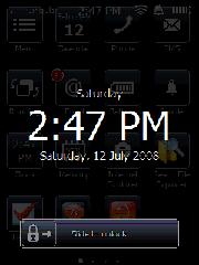
The way it is set up is that when you turn on your machine, a lock screen will appear that displays the day, time, and date. To open the program, slide the padlock to the right. Alternatively you can use an arcing left to right gesture across the screen. This gesture will take you to the opening page of Winterface from anywhere within any application, which is a handy feature. To navigate back and forth between pages, use a finger gesture in the direction you want to go.
When sliding between pages with your finger, you have to be careful not to linger on an icon because you will activate it. I suppose that’s why there is always a black spot on the lower right corner of every screen. Use this area for finger scrolling.
The opening page of Winterface is a somber black screen with the default white icons in 15 bluish bordered boxes. These boxes contain what may be considered the most vital functions that a user would probably want to access such as calendar, phone, SMS, running programs, email, battery status, profile, clock, memory, and Internet Explorer.
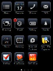 A Menu icon in the upper right corner allows you to change the screen content from your loaded applications, settings utilities, and contacts. You can change the onboard language as well here. There is a Help button, but there was not no help loaded on my copy of the program. Perhaps that’s coming. To make an application appear, simply scroll through the list with finger strokes until you get to the one you want. Tap it and then tap the check mark at the bottom right, and it will appear on the screen. I appreciate that you can tap as many as you wish without having to go back and forth each time.
To change the position and organization of the icons on the screen, tap and hold anywhere on the screen. Suddenly, all the icons will begin to jiggle as if they were on a bed of Jello. Drag an icon where you want it and drop it. To delete it, tap on the red X in the upper corner. To stop the earthquake motion, tap on the navigation/joystick button.
Another nice feature is that when you have messages of any kind, that application’s button will display the number of unviewed messages.
I don’t know if the number of pages you can have is infinite for I grew weary of placing icons after filling up six pages, which is certainly adequate for most users. A series of white dots appears at the bottom of the screen to indicate how many pages there are and the dot corresponding to the page you’re on lights up. I thought you might be able to tap on a dot, and it would take you to that page. But that’s not the case--perhaps in future editions.
I wish that it were possible to access the main menu from every page and that it were possible to place new icons on the current page instead of having to drag them around across pages. Perhaps this will be possible in future editions.
While it is certainly easy to pull up your contacts, I thought it would be nice if Winterface had a favorites contact module. However, you can easily create your own by placing your favorites on a designated page that you can readily glide to with finger strokes.
Winterface is also a task manager. To access this function, tap on the Running icon. It will display all open applications. To open that application, tap on its icon. To close it tap on the red circle.
I must say that I was disappointed at the paucity of functions offered in the task manager. For instance, there are some task managers that have a dozen or more functions such as close all, close all but active, soft reset, rotate screen, Today screen, and more.
Another surprise was the inability to create folders where you can place related items. For instance, it would be useful to have a game folder or a folder of dictionaries. I suppose that the work around is that you could create a separate page with all your dictionaries on it. But this involves more navigation.
It would also be great if you could generate a folder containing your favorite files for easy access and perhaps subfolders. Currently, it is not even possible to place individual files on the screen pages.
While talking on the phone, my unit started going off like a hand grenade with three different appointment reminders. I had a heck of a time getting out of Winterface to dismiss them. I would like to see an easy way to get to reminders and notifications built into the next version of the program. That information should be available on the front page.
Finally, I’m not sure why Vito insists on this gloomy new black look. I suppose the color or lack of color is in keeping with the name Winterface though. I think Vito thinks it is more businesslike, for it is a unifying theme pervading all of the new finger-friendly applications. Lighten up Vito. Life’s short. Let’s have some fun with a little color. Who watches black and white TV anymore? Anyway, it’s nice to be able to see the colors of your familiar application icons on the pages following the first page.
Other than those few items on my wish list, I found Winterface to be an easy to use, valuable program that gives vastly increased functionality to your handheld touch screen device.
Try it free for 15 days. I can be yours for $19.95 from www.iwindowsmobile.com.
Posted by conradb212 at 05:14 PM | Comments (0)
July 07, 2008
InterKey Keyboard
There is a proliferation of SIP keyboards for Windows Mobile touch screen devices lately. My longtime favorite is Tengo because it uses only six keys to get the basic job done. Some other new arrivals include TouchPal and ZoomBoard, both interesting choices to consider as well.
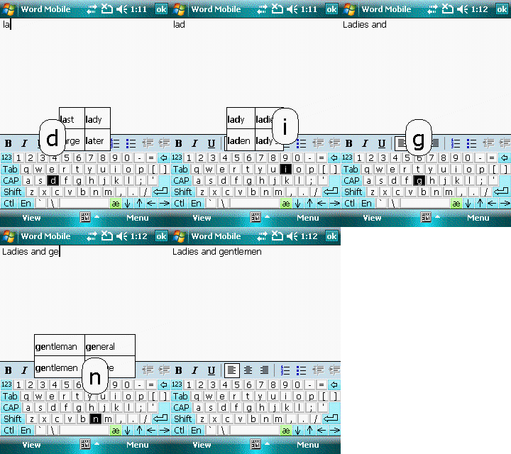 InterKey derives its name from its International aspect by supporting 36 languages and 60 keyboard layouts: “Inter” for international and “key” for keyboard=InterKey.
It offers two layouts in English, one with a small keyboard more suitable for use with a stylus, and one with larger keys meant for finger inputting. A nice feature is that when you tap on a key it appears in a magnifying glass bubble. If you accidentally hit the wrong key, all you have to do is slide to the correct key. This helps to eliminate errors.
In a pinch, if you lose your stylus or you have petite fingers, you can get by with finger inputting, but with my gorilla grips, I prefer the stylus. I do appreciate the popup, magnified key and being able to slide to the correct destination.
InterKey has more settings than some of the other keyboards I’ve tried. For instance, it has an optional autorepeat that allows you to set the delay. You can change the font size and weight. The previous version let you jazz up the appearance with colored keys and 3D look, but that’s gone in the current version—too bad. These controls are available from the general Settings area where you can also enable gestures, if you wish.
There are two flavors of InterKey, Professional and Standard. The main difference is that the Professional version offers predictive text, which is a nice time-saver. But, it costs ten bucks more for this word completion feature. It is a quick learner too; type a new word once, and it knows it the next time. You can also clear the word database and start over if you wish.
InterKey works with WM 5/6 touch screen devices with 32/240/640x480, 250x240 and 320x320 screens.
You can purchase if from Handango at www.handango.com for $24.95 for the Standard version and $34.95 for Professional model.
I found InterKey a solid product and could discover no glitches. I do think it is a tad pricey considering that it doesn’t do all that much more than the standard onboard keyboard with the exception of all the languages and layouts, which I guess is what you are paying for. But, if you are a monoglot, stuck with English, it may not be the best investment.
Posted by conradb212 at 01:39 AM | Comments (0)
July 05, 2008
Filing made easy with SimplyFile
It is probably safe to say that most of the world uses Outlook. As Windows Mobilers, we use it on our handhelds as well. So, what happens on the desktop usually carries over to the handset. Accordingly, I would like to tell you about an application that I recently discovered that I think will make your life easie It’s called SimplyFile.

SimplyFile has the ability to direct messages to the proper category file in one click. It’s much faster than dragging and dropping, and way faster than setting up rules. I never did like the rules route because it requires that you check each folder for new mail, and if you have a lot of folders forgetaboutit.
Over time, I’m sure that most of us start developing a huge hierarchy of folders congratulating ourselves on getting organized. But things tend to pile up, and it gets to be a chore putting every message in its proper place. Enter SimplyFile to save the day.
Basically, SimplyFile is a trainable filing clerk. The more you use it the smarter it gets. All you have to do is click on an email, and it intuitively sends it to the proper folder. If it guesses incorrectly, there is a drop down box containing all your folders, and you can just click on the right one. This is how you train it. Next time it will probably guess the right destination.
But, SimplyFile does much more than stuff incoming mail into the right pigeon holes. Have you ever wished you could get all your emails together in one place, both ingoing and outgoing for a particular category? SimplyFile will do that for you without having to go to the Sent folder to drag them over, a laborious task that I reckon few of us bother with.
It will convert messages into Tasks and Appointments with a single click. It will transform HTML into text.
SimplyFile has a small footprint at only 495 KB. It will not force you to change the way you do email; it stays in the background unobtrusively until you call on its powers. It doesn’t slow Outlook down, and it doesn’t require setting up complex rules. It just works.
However, it does have a strange propensity to disappear from the Outlook toolbar and will not reappear until you close and reopen Outlook. There seems to be no explanation for this strange behavior.
SimplyFile works on Windows 2000, XP, and Vista with Outlook 2000 SP3, 2002 SP3, 2007 SP1; it does not work with Outlook Express. It works on desktops, laptops, tablets, and UMPCs.
I am pleased to give SimplyFile a very high recommendation. I consider myself lucky to have discovered it, and I think you will too. Now, life without SimplyFile would be like trading in a Ferrari for a horse and buggy.
Posted by conradb212 at 01:44 AM | Comments (0)
