Our proud sponsors:


|
|
|
|
|
|
Barnes & Noble NOOK TabletA tablet with character, but where will it go?by Daniel Rasmus
The iPad was purportedly inspired by the Star Trek P.A.D.D. or Personal Access Display Device. Those fictional devices had character. As much as I love my iPad, it is to some degree mundane in its elegance, and most of the other manufacturers have chosen to follow the path of exposed glass displays with smooth backs, nearly hidden buttons and submerged speakers.
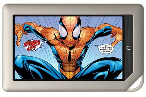
The Barnes and Nobel Nook is a 7" tablet that was designed for reading. That is the lens through which this device must be seen. With an outstanding 1024 x 600 pixel display and a wide range of content, it offers a solid reading experience, if not a superior tablet experience. Yes, it plays movies and lets you shoot pigs with birds, but it isn't designed as a content creation device. The Nook has no aspirations to replace your notebook computer, just supplement your reading and offer a few distractions along the way.
The Nook does not provide for video out and does not support Bluetooth, reinforcing its consumer-driven, rather than business aspirations.
The Nook offers very competitive battery life, with up to 11.5 hours for reading and 9-hours for video playback. I have not tested these specifications to the extreme, but full day use under a variety of conditions never challenged the Nook's battery.
As a consumption device, the Nook should be able to read and display a wide variety of content types. And it can. Textual content can be downloaded via USB or SD card in CBZ, XLS, DOC, PPT, TXT, DOCM, XLSM, PPTM, PPSX, PPSM, DOCX, XLX for PPTX formats. Video formats include MP4, or Adobe Flash Player format, 3GP, 3G2 MKV, WEBM (Video Codecs: H.264, MPEG-4, H.263,VP8). The nook can read and display JPG, GIF, PNG, BMP images or use them as wallpaper. Audio formats supported include MP3, MP4, AAC, AMR, WAV, OGG (Audio Codecs MP3, AAC, AMR, LPCM, OGG Vorbis). Audio plays via the built-in mono speaker or stereo via the headphone port.
For entertainment, the Nook concentrates on streaming via applications like Netflix and Pandora. If you want to use all of those media decoders off-line, you will have to put your own content on the Nook, from sources other than Barnes and Nobel.
As for books, B&N makes 2.5 million books available. Plenty of reading options for anyone. The most impressive of the books come in the form of interactive children's books. They make the Nook a child's companion, not just a reading device.
The Nook also offer basic e-mail and browsing capabilities.
The Nook is a full tablet, but one focused on reading. And the reading experience, while it is taking place, is a good one. It is important, however, to note that the organizational metaphors are inconsistent and overly complex, we'll come back to that.
As Star Trek Voyager's Seven-of-Nine might have said: "Their solution was flawed."
For some reason tablet manufacturers, all of them, treat digital content the same as they do physical content. Content is segregated in a way that makes browsing in a physical space efficient. If you are looking for Star Trek the Motion Picture, then you go to the DVD section of the store. Iin the case of tablets, you visit the video section. If you want the book, Obsessed with Star Trek, you go to the book section. As collectors of content, we need not be constrained by the physical limitations of a retail experience. I have Star Trek videos nestled cozily among Star Trek tomes. How much more so should alternative forms of organization become the norm on digital devices, where only metadata limit the organizing structure.
To some extent, the Nook permits alternative forms of organization via its "Shelves" feature, but the "shelves" don't feel natural, or perhaps a better way to put it, is they don't feel primary.
And that is perhaps the biggest issue with the Nook's UI: having a real point-of-view on how to organize content. On the iPad, organizing from Apple is pretty consistent, though inside various apps organizing notebooks or files can differ. At the iOS level, books, magazine and apps are all organized in the same way, despite variations in the eye candy associated with different containers (e.g., the Newsstand looks different than an app folder, but the behavior of objects in each container is the same).
The Nook's UI for individual apps is also confusing. In the New York Post, you enter through a graphic of the front page, and are then take to mostly text stories from the current issue. To return to the main page, you click news, which, then returns you to the top of the new section, not the page you were scrolling on. And then there is the entirely different menu that pops up with you tap near the bottom of the display, one button of which, is for "content." Tapping "content" reveals a table of contents button. There is no way, as on standard Android devices, to just go back to where you were last browsing from the navigation standpoint.
And then, if you accidentally tap on the "Nook" button, you can't escape that action. You either select an item from its, yet different looking menu, or you click it again and return to the main home screen. You can, however, click on "keep reading" in the upper left of the display to return to your last point in a text.
And for recent apps and reading material, the Nook scrolls them along the bottom, or provides access to them via the "More" menu in the upper right of the display (primarily here, books and movies, not apps). And unfortunately, the "magic" "More" is only displayed on the home screen.
In terms of navigation: too much and too little at the same time.
The platform guides authors through the creation of books from Word, XTML, .txt and .rtf. PubIt! outputs files to industry standard ePub format.
This isn't a big draw for readers yet, as it remains to be seen which of the various publishing platforms between Nook, Kindle and iPad attract the most innovative and intriguing authors.
Software is the Nook's Achilles' Heal. If B&N wants to be competitive, even at lower price points, they need to concentrate more on the entire reading experience, not just the in-book experience. The company can't compete with Amazon's deeper online retail presence, so they have to offer a better consumption experience. In particular, B&N needs to focus on the content and file interface, as well as simplifying navigation. The software provides many different ways to access, get to, and organize content. Too many ways. If Android can be skinned with complexity, it can be skinned just as easily with simplicity. Perhaps more community and social features built into the books could make the Nook a competitor to upstarts like Kno and Inkling in the education market. Rather than make a better tablet, make a better next generation book. There is still plenty of work to be done.
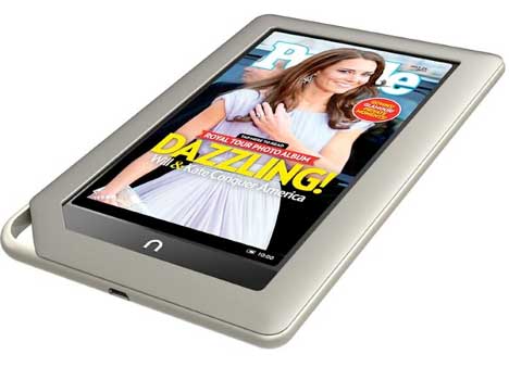
As a pure hardware experience, Nook feels good in your hand, It is attractive and its's responsive. If you know what you are getting into, then the Nook might be a good alternative for replacing paperbacks and newspapers. Its hardware is strong enough to live through a few software upgrades, so the user experience will likely improve with time.
Nook won't survive unless Barnes and Noble go disruptive rather than competitive. We'll have to see how they incorporate their exposure to Microsoft's technology. My advice: look to the labs; don't just talk to product engineers on near-term products. There are some very cool technologies floating around Microsoft's labs that they don't even know what to do with. Perhaps a long-term book publisher will discover some ways to put those ideas to work.
Or, perhaps Barnes and Noble should go all in with the P.A.D.D. metaphor and work with Paramount to make the Nook a real 23rd-century looker. With Android's open source roots, B&N could make the Nook anything they want it to be--right now it appears to still be a work in progress, and I don't think that is what they are after.
I'm certainly intrigued enough to stay tuned.
See:
Daniel W. Rasmus is an independent analyst and strategy consultant. He is a former Vice President at the Giga Information Group and Forrester Research. Dan is the author of five books, including Management by Design (Wiley, 2010) and Listening to the Future (Wiley 2008). He blogs regularly at http://danielwrasmus.wordpress.com. Additional information can be found at http://danielwrasmus.com.
|
 Unlike the competition, the Nook Tablet (not to be confused with the older, slower, but very similar Nook Color) has character. It looks more like a P.A.D.D. than any other device. It feels like a working tool, something meant to be used, latched onto a belt or bag, tossed on a table. I don't suggest taking those actions, but the hardware makes, at least me, think of the device in a much more rugged way than might be imagined with thinner, or more fragile tablet devices. The Nook feels like a real science fiction prop that just happens to work, if that means anything. For us nerds, that means something.
 At 14.1 ounces, the Nook feels solid and well-constructed. The 1GHz dual-core processor is outfitted with either 512MB of RAM on the 8GB design, and 1GB of RAM on the 16GB version. Wifi is standard. No 3G option included or expected. Plenty of horsepower and networking speed.