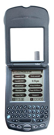
Handspring, makers of the Visor line of expandable handhelds, has launched a product that they believe heralds the future of mobile computing: the Handspring Treo 180, a GSM cell phone with the Palm OS built in. Coming in two versions, the Treo (pronounced "trio") began shipping February 11, 2002. Users can choose the Treo 180, with its built-in keyboard, a first for a Palm OS device, and the Treo 180g, with its more standard Graffiti interface. Which model will be preferred has yet to be seen, but both models offer advantages and disadvantages which I will discuss. What is clear is that many will gravitate to the Treo, regardless of the interface. Integration of the PDA, cell phone, and pager is done well enough that the three functions are enhanced by their combination.
Form factor
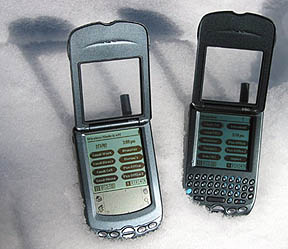
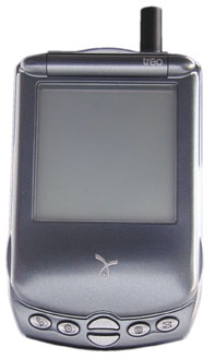
With its flip lid and standard six button array across the bottom, the Treo 180 really does look like a Palm device merged with a flip-style cell phone, especially resembling those from Motorola. It's a little smaller than a regular PDA, and a little wider than an average flip phone. And with a holster, it's about the same size as a RIM 957 on the hip. With its tapers all around, it sits comfortably in the hand and doesn't cut an offensive profile in the pocket. It's no Palm V in slimness, but it follows the philosophy well, with its overall bullet shape profile. The dark blue-gray plastic shell is attractive and understated, with the contrasting dark silver buttons and Handspring logo.
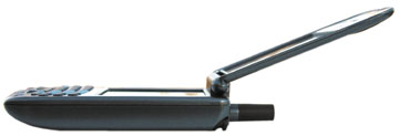
The flip lid has a clear window to protect the screen and offers a full view of the screen to show incoming call information. Lift up on the lid, and at about 20 degrees it springs open and the screen comes alive. The speaker/earpiece is integrated into the underside of the flip lid. Depending on the model, either the keyboard or Graffiti area is revealed as well. The Graffiti area on the 180g is mostly standard Handspring fare, but the keyboard on the 180 is unique. We'll come back to that soon.

On the right is the stylus, the shortest to date, with the reset pin concealed in the tip. There is no Philips screwdriver in the cap this time, a hardware Easter egg found in the Visor.

On the left is a toggle dial which changes function depending on the mode. When there is a menu or list on the screen, you can scroll up or down and select with a press in on the toggle. Once a number is selected and a call is in progress, the toggle can be used to adjust the volume. Just above the toggle is the headset jack.

On the top, from left to right, is a lanyard point, a ring mode switch, the status LED, the power switch, and the antenna, which juts up about 3/4 of an inch. The lanyard point is for whomever chooses to use it, though no lanyard is included. The ring mode switch allows the user to quickly change between ring options. On loud, the ringer does whatever the user selects, be it loud, soft, or off. Switched to speaker off, no alarms of any kind sound, including rings, Date Book, or other timer alarms. Users can set the vibrate feature to remain on in this mode for a more quiet alert. This is a feature that Handspring Co-Founder Donna Dubinsky requested. One request I've made is the option of a middle setting, if not a 10 point range of volume settings for the ringer like they offer for the volume control. In my pre-release model, all I have are Loud, Soft, or off. One is too loud, the other too soft. Call me Goldilocks, but how about a "Just Right" setting (or maybe Medium)?
The rings, by the way, are mostly mundane beeps, but the "Flyby" ring and "Sparkle" notification sound are cool. The former sounds like a futuristic electronic beeping beetle zooming by, and the latter can only be described as the audio version of a bright point of light being reflected off a drop of water. Odd, I know, but so are the sounds. People definitely take notice.
The status LED flashes green when network signal is good, flashes red when no network is present, and is solid red when charging is in progress. The adjacent power button serves a few functions, perhaps too many. A quick tap turns the unit on from sleep, just like flipping the lid open, only you power up in the last application active instead of going to Speed Dial. A quick double tap turns the backlight on or off. Holding the button down turns the cell phone on or off. As I say, this can be confusing, for in the middle of a data call recently I accidentally turned off the cell phone feature while trying to turn on the backlight. That was mostly because holding the button down is usually the method for turning on the backlight with other Palm OS devices; the experienced Palm OS user will only have this problem for a short time until he gets used to his new Treo.
The back of the unit has only three items of note, the new HotSync connector, the reset pin hole, and the SIM Card door (the reset hole actually goes through the SIM card door). Opening this door reveals the compliance logos and the SIM card, which slides into slots on the door. The device's serial number is located on the inside of this door, behind the SIM card, so don't call tech support with the Treo or you're going to get frustrated when they ask for the serial number and you realize that you're going to have to shut down the phone and remove the SIM card to retrieve and read it to them.
Connections

There is no cradle included with the Treo, instead you get a HotSync cable with an integrated HotSync button, and an AC charger, which can plug either into the HotSync cable or directly into the Treo itself. As the pioneer of the cradle in the original Pilot, this is the first time Jeff Hawkins has shipped a device without it. Post-Hawkins Palm Inc. tried going without a cradle with the m100, but subsequent models came with a cradle. Sony likewise does not include a cradle with their S320/S360 line, but one is available as an option. I'm hoping that Handspring will also offer one as an option with the Treo, because I've had a problem with the cable getting tangled with my phone cord and sending the Treo on a three foot plunge to the floor. This is less likely to happen with a cradle, a more permanent fixture on the desktop, where the cable usually dangles over the back of the desk instead of the front. My cell phone doesn't have a cradle, true, but I usually charge it in the car, not on my desk. On my desk this important device needs to be more secure. I'm told a cradle is likely to appear soon.
The AC charger, by the way, has folding prongs and is lightweight, and the sticker on the back says Motorola, perhaps further indication of who actually manufactures this phone.
The new keyboard
Speaking of leaving traditional Palm OS features like the cradle behind, the integration of the thumb-operated RIM-style keyboard effectively replaces another innovation Hawkins pioneered: Graffiti text input. In its current iteration, though it includes the Graffiti engine in a dormant state, the Treo 180 offers no form of Graffiti text input. Users hooked on and capable at Graffiti have the option of the 180g, but there are some compelling reasons to want that keyboard; in the final analysis, having used both models, this Palm OS user wants both options in one device. Since that doesn't exist, we'll all have to choose. Hopefully my narrative will help you choose which is for you as I explain the motions of using the keyboard model first, then how the Graffiti model compares.
First the basics

To make a call, flip up the lid. The first thing you are presented with is the Speed Dial screen that we saw in the VisorPhone. You can choose any one of these buttons with the stylus, your finger or fingernail, or you can scroll through them with the toggle. There are five Speed Dial screens, each with ten buttons. You can dial your programmed selections with a single tap. If you press the phone button, you are taken to the standard ten-digit keypad. Here you can just tap in your phone number. Press this button again, and you go to the Contacts list, which essentially replaces the Palm OS Address Book (here it's called Contacts, but in the Application window it's called Phone Book-a little confusing). You can scroll through this list and choose your numbers or use either the keypad or Graffiti to search for a first or last name. This is a powerful feature, one that doesn't exist on other Palm OS devices. The final phone screen is the Call History, where you can see all incoming and outgoing calls with their time and duration. You can also call the person back or re-place a call with a single tap.
Here's the cool part: the Treo is pretty good at guessing what you want to do after only a few keystrokes, without doing most of the things I just described. If I want to call my friend Jim, I can just flip the lid and start typing his name, either first or last, and in just a second or two the Treo has listed the seven Jims that are in my 1,000 plus address book. It lists their full name on one line, so you can actually read it (names are usually truncated in the standard Palm Address Book), and the full numbers one line below. If there are multiple numbers listed for that name, they're all listed. If you wanted their address, just tap on the name. If you wanted to dial one of the numbers, you can scroll down with the scroll buttons and press the space bar to dial, or use the toggle on the side and press in to dial, or use the stylus to tap and choose dial. Multiple options, all very fast. If I don't even want to see the other Jim's, I can narrow it down: Jim Teter can be reached directly by typing in "jtet," first initial and beginning of last name. Extremely efficient.
Likewise, if all you want to do is enter a number from your mind or a piece of paper, just use the keyboard's embedded numeric keypad, which is marked with little blue crescent-shaped accents and numbers. As you type the number, the Treo, within four keystrokes, has usually figured out that this is likely a phone number, since few names can be formed with those nine keys, and you're switched to keypad mode where the numbers you've dialed appear in large type across the top of the screen.
Here's where the keyboard has an advantage: you can do all of the above easily with one hand. Graffiti always takes two: one to hold the unit and one to write. Dialing and Contacts lookup is comfortable and simple with the phone interface Handspring has created.
But ironically, while the keyboard helps with the phone services, where only a few keystrokes are necessary, it's with the data services, which are typing intensive, that Graffiti can actually have an advantage. As I said, Graffiti takes two hands. But when you start to type a long message on the keyboard, you're going to want to get both thumbs in on the action. Suddenly both hands are involved, as are both of your eyes, searching for the keys on the wonderfully and purposefully confounding Qwerty keyboard (if you don't know, the Qwerty keyboard layout was made intentionally difficult in the early part of the last century to slow typists down so that early mechanical typewriters didn't get jammed). Hunt and peck isn't as easy with big thumbs in the way hiding most of the keys from your flitting eyes. I'm actually pretty fast at both Graffiti and typing, so I don't have much trouble with either, but I prefer the way I can write Graffiti without having to concentrate on the keyboard. I can take notes in meetings with Graffiti and still look up for long periods of time as I write. With these tiny keyboards, your eyes and attention must be on that Qwerty menagerie or you don't type at all. Unlike full-size keyboards where eight fingers rest on home row, few will ever master touch thumbtyping.
To compete with the RIM pagers and cell phones, the Treo 180 has it going on with its integrated keyboard. But I'm afraid the PDA function suffers just a little from this omission of Graffiti, which allows more casual note taking while actually appearing to listen to those around you. When some programmer creates a half-size fly-up Graffiti area, or even a floating one as first appeared on the Apple Newton, I'll be able to say that the Treo 180 approaches perfection. The Graffiti engine, according to Hawkins, is still in the 180, waiting to be put to work. Send me an email, programmers, when that floating Graffiti area is ready. I've tried RecoEcho, which allows you to write Graffiti right on the screen, but punctuation is a problem, because the version I have requires you to tap in the Graffiti area, which doesn't exist on the 180.
The Graffiti model performs the basic phone lookup functions identically to the keyboard model, just flip up the lid and write a few characters, and with two more taps you're on the phone with someone listed in your Address Book. Likewise, less intelligence is necessary to divine that you're trying to enter a phone number, because you're writing numbers in the number side of the Graffiti screen. Write one number and you're at the dial pad.
The 180g also has the standard icons in the Graffiti area, making access to the Palm OS Applications screen as easy as on any other Palm OS device. The keyboard model requires a little more. You have to press the blue function button on the left and then the little house button on the right. This button normally functions as the Menu button, issuing the command given by an upward stroke from lower left to upper right when using Graffiti. It is critical to remember this, because one program included with the beta version of my device does not respond to my tapping on the tab at the top of the screen to launch the menu, it requires the special command button. Most other applications work as expected.
As an aside on the keyboard, many have asked whether pressing such small buttons is difficult. It's actually surprisingly easy, since our fingers and thumbs are sufficiently rounded, especially on the sides and tips, where you're more likely to use them to type. Sure, if you press down with the soft center of your thumb you'll hit a few buttons at random, but if you angle them down toward the nail a little, it's pretty simple to hit the right button almost every time. Incidentally, readers will notice that the keys on the Treo all angle to the right. This was due to a patent RIM claims to the counter-angled buttons that appear on their devices (the left half of the keys angle to the left and the right ones angle to the right presumably for easier access with the thumbs). Handspring says it didn't matter much to them, since they're just as easy to press either way, and I'm in agreement.
Of the two options, Graffiti or Keyboard, I think I could live with either interface; it would just take some time. If you're looking for a phone with very fast access to a rather large address book, and that's all you're likely to use a PDA for, then the Treo 180 is a great choice. If you're coming from a Palm OS device that you use for a lot of data entry, note-taking, or other specialized applications, you might feel more comfortable with the 180g. Commendations to Handspring for taking the trouble to let users decide. If one or the other turns out to be significantly more popular, I'm sure economic reality will remove this choice from the table; but for now users can vote with their wallets.
But that's not all
Okay, so that's the phone function. Whew. There are three more buttons on the front to cover, though. Just right of the Phone button is the Date Book button. Not much new here. It's just the excellent Date Book + we've seen on the Visor since its inception. Gone, by the way, is Palm's original Date Book. Both used to appear in the Application view on Visors, but now there's only the better one, based on Pimlico Software's DateBook 3.
On the right of the scroll buttons we find that the To Do List and Memo Pad buttons have been replaced, as they have on the Palm i705. First is the Blazer button, sending you straight into Handspring's powerful browser, and the SMS button, where you can read and compose short messages to other GSM phones or even to regular email addresses.
Blazer has been a part of Handspring's long-term wireless strategy for over a year now, and they've put it to good use in the Treo. Just press the Blazer button and you're taken to the home screen, which you'll see is "powered by MSN." I have to say, the features here are not the greatest. MSN's service is pretty weak, and has very outdated content, sometimes two to three days behind on news. So let's forget MSN and press that Blazer button again. Here you find something akin to the phone's Speed Dial screen. Only now the buttons are square and more information can appear in them. There are ten buttons per page, and ten pages total, instead of the Speed Dial screen's five pages, for a total of 100 URLs you can associate with each button. I'd say that's enough for my browsing needs, whether mobile or on my desktop. When browsing, just select Add Bookmark from the menu and categorize the entry if you like, and your first Speed URL is programmed.
Because the 160 x 160 screen can display so little, Blazer, like other handheld browsers, takes each individual graphic and reduces it to fit the screen. But before it delivers even a single graphic, it downloads all the text so you can scroll down and get what you need before waiting for all the images to be resampled for your small screen. This "text first" model is the way some earlier browsers for PCs did their work, and it worked well for low bandwidth connections. At around 9600 baud, the Treo connection fits that description, though it performs reasonably well (GSM performs at about 14.4 Kbps, but the Treo and Blazer average in the 9.6 Kbps range, according to a representative).
The Treos are GPRS-ready, meaning that when the carrier's GPRS networks are fully tested and ready, the Treo will be able to support the higher bandwidth connections offered by the standard. Until then, connections with software like Blazer and the included One Touch Mail from JP Systems will have to be done through dialup. Yes, just like the old days, you need a dialup ISP service to use these apps, and you incur a toll for the packet-switched call. It takes about 15 to 25 seconds to connect. There are different service plans depending on the carrier. Cingular offers a few plans, one of which costs US$6.99 per month and allows use of 100 of your overall plan minutes for data. Their Data Connect service is US$4.99, and 15 cents a minute in addition to your regular connect rate. Verizon will be offering a plan where data minutes are billed and deducted as voice minutes, certainly easier to comprehend, and more likely to encourage use of the device's data features.
SMS
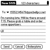
While browsing and email require dialup, SMS, the last button, is an instant, always on service, much like a traditional pager. My demo unit was on Cingular's GSM network, and I have to say SMS is amazingly fast. Not that others aren't, I was just surprised. I sent a note to my AT&T phone and the message arrived one second after I pressed the send button. I hadn't even set the Treo down. That bodes well for both services, and it took place in an SMS-to-email transaction. As I've used the device I've also been able to SMS certain people at Handspring, and their answers often came back in less than a minute, testament to both the network speed and the speed of the Treo 180's keyboard for composing short messages.
The allowed length of SMS messages is only enough for a sentence or two, but it certainly serves its purpose, and lives up to its name. They're supposed to be short messages, after all. And if the short messages aren't working, you can just select the number associated with the message and select Call Sender from the menu to have a voice-to-voice chat (when messaging with a phone on the same carrier's network, that is). A corporation standardizing on Treos could put this service to good use. The Treo's keyboard, and even Graffiti, makes the SMS service considerably more usable than phones with the ludicrous T9 interface included in standard nine-digit cell phone keypads.
In use
There are two modes for talking on the cell phone. In the traditional mode, you dial the number as previously described and press the phone against your head. The other option is Speakerphone mode. I like this idea a lot, because you can have conference calls with your portable phone or just set it down on the table and talk. In my demo models I had a few problems, the speaker was really not that loud, so I sometimes couldn't hear the person on the other end in my car. Speakerphone is also not really loud enough in these demos either, but Handspring tells me that all that will change in the shipping models. Another problem I have with both versions of the Treo is that they're none too comfortable against the ear. The earpiece is designed to look nice when closed, completely enclosing the keyboard, but that means it has somewhat sharp edges cutting into my ear. It's also not intuitive exactly where the speaker is in relation to your ear, because the flip lid is necessarily so wide. With the low-volume speaker in the demos, speaker alignment was important. One can also use a headset with the Treo, eliminating the ear irritation, but adding the dangly-wire irritation, cutting the overall portability of the Treo. I like the improved speakerphone idea better.
Like the VisorPhone, the Treo is capable of handling a call while you look up other information. When you're talking on the phone to one person, you can put that person on hold and either answer or make another call, or even have a conference call between the three of you, and you can still look up information on your device, or take notes. If you're on a data call, you can maintain your connection while you switch from Blazer to One Touch Mail to get your messages, not uncommon with Palms, but worth mentioning. These features exist on a lot of other cell phones, but Handspring has done some work to make it a little easier. Note: when on a data call you cannot send or receive a voice call.
The backlight on the Treo follows Palm and Handspring's trend of sending light through the black pixels, which is usually an ineffective solution in low light. I'll keep harping on this as long as they continue to ignore the superior usability I find in Sony and HandEra monochrome handhelds, with their real backlights behind actual black pixels. The Treo's inverted backlight, however, is better than most of Handspring's Visor offerings.
As with all Palm OS devices except Palm's m505 with its lighted Graffiti area, users are left in the dark when in the dark. You can see the screen fine, but you cannot see the keyboard or Graffiti area. One can usually guess pretty well when it comes to Graffiti, but the Treo 180 demo I used leaves the phone's main interface-the keyboard-pretty worthless without some external light source. A lighted keypad is something that even the cheapest cell phones have, but this US$400 wonder is missing. I have it on very high Handspring authority that there might be a solution to this problem in the works, but I cannot be sure; at any rate, it will not be appearing in the initial models.
Both Treo 180s are well-designed products that should soon have a lot of followers. They are far more than PDAs, cell phones, or pagers. As Handspring puts it, they are communicators. A few will criticize that for communicators, they don't have enough expansion options, like an SD or Memory Stick slot for example, but I think Handspring made the right choice for this first model in keeping it as simple as can be. Frankly, I'm impressed that it has so many features, given this team's propensity to throw out anything that might make a device too complex. 16MB RAM offers ample storage for most anyone likely to want such an integrated device, and the HotSync function allows you to share and backup data on your main desktop or portable computer.
A technophile myself, I'll be interested to see how novices approach the Treo. Well aware that most Palm OS users only use the Address Book and Date Book, and that most cell phone users don't go beyond the keypad, Handspring is betting a lot on their rethinking of what a cell phone interface should be. While their speed dial buttons and easy lookup options are magnificent innovations, bundling a cell phone with a PDA and pager-style device and then getting new users to adopt an interface that is driven by three input methods (keyboard, touch screen, and toggle) is ambitious. Palm OS users may feel at home, but basic cell phone users could be overwhelmed before they can discover how easy the basics really are.
Much like a basic Palm OS device, the Treo is very easy to approach and use, and yet is capable of great depth of function for the user wanting more. It will be interesting to see what programmers are able to do with it.
If you're tired of carrying three devices, you might want to give the Treo a look. It's light, small, and nice looking with just about everything you need, including fairly sturdy screen protection. Add the costs of a digital cell phone, a PDA, and a pager together, and the Treo's US$399 price tag looks pretty good. Throw Web browsing and wireless email retrieval into the mix, and it's looking even better. The Treo 270, with an advanced technology color screen for US$599 is also already announced, and expected sometime in the Summer of 2002. Watch for a review of that one when the time comes.
-Shawn Barnett
Sidebar: The Stylus Quandary
Switching users from Graffiti to the keyboard in an integrated device leaves a slight problem. What do you do with the stylus when you're either typing or talking on the phone? Though switching to the keyboard eliminates the stylus' utility for entering text, you still need something to tap on the screen in this graphical user interface that we call the Palm OS. You can use your fingernail or even your fingertip, but that's neither as useful nor as accurate as a stylus. Further complicating the problem is the Treo's initial ease of use. Usually when I need to access something on my Palm device, the first thing I do is remove the stylus from its slot. With the Treo, the stylus is still in that slot as I make my call or begin entering the two keystrokes necessary to access the Applications view. It's only then that I remember that I have to pull out the stylus. To answer my own question, the stylus usually rests where all pens do when I'm doing something else, right between my middle and index finger, ready for action. It pretty well stays in place whether I'm thumb typing or talking on the phone. It's only when I'm talking or typing for a long time that I want to get rid of it, and that's hard to do gracefully with a small phone against your head. Something to think about with any PDA/cell phone.
Sidebar: Star Trek Connection?
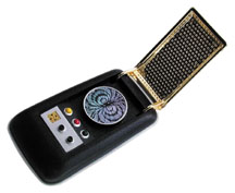
Might there be some connection to Geordi LaForge and Captain Kirk in the Handspring product line? When last in Las Vegas, I was wandering through the Star Trek: The Experience exhibit, and I came across Geordi LaForge's VISOR, a fictitious high-tech device that allowed the blind Geordi (played by Levar Burton) to see. I wrote down the acronym's definition in my Visor, but have since deleted it. I think it's something like "Visual Instrument for Sensory Organ Replacement." I deleted the note because I finally decided I'd never come up with a reason to use the factoid, but now that Handspring has chosen to call their new device the Treo Communicator, I'm forced to wonder if good old Star Trek hasn't had some influence on the folks in Mountain View. Treo sounds like a veiled reference to the multi-purpose Tricorder device used on the science fiction show to scan for all manner of materials, and the Medical Tricorder can find what ails one with amazing speed. And of course Captain Kirk was commonly seen flipping open his Communicator to ask Scotty to beam him up (as opposed to just beaming him an address). It's a shame they didn't put the cool chirping sound into the Treo just for effect. Most surprising is that the one device on Star Trek that truly resembles our modern (ancient?) PDA is the PADD, yet no one has taken advantage of the similarity. Probably a copyright issue.
Though I understand that Rob Haitani, Director of Product Marketing, is a big Star Trek fan, when I posed the question to Jeff Hawkins at a recent Palm User Group Meeting held at PalmSource 2002, he said no, he wasn't a science fiction fan and it really had no direct influence on their product naming strategies. I thought it was very courageous, by the way, to say that you're not a science fiction fan in a Palm User Group meeting, but that's beside the point. He explained again that Visor was more about advisor, etc., and that one of the big difficulties in creating new products these days is that it's so hard to find a word that isn't already trademarked. Pretty amazing set of coincidences, though.
Sidebar: Easter eggs
The first Easter egg-like item we know of is the date and time option you may have seen on some of the screenshots. When programming your Speed Dial buttons, you can enter two special codes in the Name field that will transform that button into either a display of the date or time. You can still program these to dial a number, by the way. The codes are &date and &time. Because the Treo doesn't tell you either of these data when you open the screen, it's a great trick to know. Got that one straight from Jeff Hawkins himself.
-Shawn Barnett
Specs:
Processor: 33MHz Dragonball VZ
Operating System: Palm OS 3.5.2H
Memory: 16MB RAM
Expansion: None
Communication: USB HotSync, Wireless email, IrDA
Network: GSM; GPRS ready
Battery: Lithium Polymer
Battery life: >2.5 hours talk time, 60 hours standby
Screen: 160 x 160 monochrome; inverted backlight
Alarms: Tone, LED, Vibrate
Dimensions: 4.3 x 2.7 x 0.7 inches
Weight: 5.4 ounces
Email compatibility: POP3, IMAP4, SMTP
Price: US$399 with service activation, US$549 without service
www.handspring.com
-Shawn Barnett
Questions? Comments?
Back to Palm Section

