Palm m500 and m505
New expansion, new OS, a whole new system
by Shawn Barnett

July, 2001
Much anticipated, the new m500 and later the m505 surreptitiously arrived at Office Depot stores across the country in late April and early May. After a long look at both new devices, and much analysis of the m505's color screen, my opinion is mixed. Unquestionably, the m500 series offers some great new functionality with its two expansion methods, new OS, and extremely fast HotSync, but even though I'm very open-minded to new technology, the color screen on the m505 is at best disappointing. But we need to get beyond that and appreciate the new handhelds from the market leader for what they represent: the next wave in connectivity and expansion for all Palm-brand handhelds.
The m500 series is the follow-on to the popular Palm V. They've maintained the form-factor almost completely, and modified the look just a little, while adding a Secure Digital expansion slot and USB to the mix. In such a small form factor, it's an impressive achievement.
Walkaround
Where the Palm V was flared only at the bottom and straight at the top, the new units flare at both bottom and top, and are more curved all over. It's subtle, but the flare at the top gives the fingers help in resisting gravity as you hold the unit in your hand. In the HandEra 330 review I mentioned that it was the first Palm OS handheld to have a truly symmetrical face with even screen placement on both sides, but I'll have to modify that, because the m500 and m505 also have this same trait. With the stylus on the right and cover on the left removed, the screen is centered, though with only the cover removed, as many will carry it, the stylus sticks out about 1mm to give the appearance of asymmetry. Past units have been difficult to make symmetrical because the electrical connections for the screen typically run up one side or the other, requiring it to be shifted either left or right. That's still the case here, but it was solved by narrowing the left rail, where the screen cover traditionally resides. On the Palm V, this served double duty as a backup stylus slot, but that will no longer be possible for the sake of symmetry (until someone comes up with a stylus that fits, sure to come). The stylus on the m500's, by the way, is almost identical to the Palm V-only it's an eighth of an inch shorter, likely because the top as well as the bottom of the new devices slope toward one another, while the Palm V was flat on top.
The new Palm logo (sans blue "ball"), all lower case, appears on the upper left above the screen, with the model number on the right. The power button has been reshaped to jut out from the more contoured top line, and it's translucent, lit by a green LED when charging or flashing an alarm.
The four application buttons are slightly larger, and they fit a little tighter in their holes than on the Palm V, though they also wiggle in these holes more. The Memo Pad button is now the Note Pad button, a change first seen on the m100. What was formerly the scroll rocker on the Palm V has been split into two round buttons, dimpled for easy use with a stylus tip and recessed to prevent accidental activation. These six buttons are black on the m500 and silver on the m505.
The large icons on the Graffiti area mimic this theme, black on the m500 and white on the m505. There are two other differences in the Graffiti area between these two devices. On the m500, there is both a clock icon and a contrast control, just like the m100. On the color m505, the Graffiti area has no contrast control, but it is lighted when the backlight is on, answering the need to see one of the main control areas when working in the dark.

Moving to the bottom, we have a brand new 16 pin connector, called the Universal Connector. This incorporates both a USB and a serial port, and is the first of the Palm OS ports to use a very tight rank of contacts. All other devices have used large pads for continued sure contact as the unit and cradle age, but Palm has really tightened up this spec. Everything is kept in place by a post and receptacle arrangement that ensures alignment, and a metal hook and square "loop" connection to lock it in place. The cradle has the hooks and post, and the connection is as easy to make as it is sure and strong. When connection is established there is a reassuring "shoop" sound, and the Palm beeps as the power button glows green. The unit cannot be removed by pulling up along the angle of incline, preventing it from being accidentally knocked out of the cradle and across the desk; instead, you have to tilt the unit forward until you hear a metallic click. As you pull up, it loses connection and a lower beep sounds confirmation.
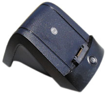
The cradle and Palm do not mate as beautifully-cosmetically speaking-as the Palm V does, but there will be added benefit to the more utilitarian open look of the new cradle: sled manufacturers can include pass-thru ports that allow HotSync and charging of both the Palm and the attached sled without separating the two units. The cradle itself is a little more overstated than its predecessor, rather evoking a woman's high heel shoe. It is well weighted.
On the back of the new m500s, we see the rest of the new Universal connector expansion solution. There are two points of contact where a sled can hook vertically onto the back of the unit, instead of the single horizontal slot on the Palm V. These contact points will appear on all future Palm products, a consistent expansion interface that Palm pledges to support for at least the next two years. This has been a long time coming, and tempers the frustration I have over the introduction of yet another new connector. Palm had to come out with a USB connection of some kind, so that was bound to happen anyway.
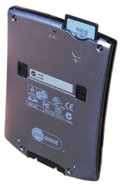
Another difference between the m500 and m505 is the back material. While the front half of both is anodized aluminum, the back of the monochrome unit is plastic, and the m505 is aluminum. You hardly notice the difference, except that the m500 feels warm in the hand and the m505 cool. The m500 weighs in at 3.8 ounces and the m505 weighs 4.9 ounces. The Palm V was between the two at 4 ounces.
Four torx screws hold the units together, T6 on the m500 I have and the extremely difficult to find T4 on the m505. This is quite a departure from the Palm V, which has always been glued, making it impossible to modify or repair. Like the Visor Edge, the two halves of the m500 series are held together by a plastic frame. It makes for a solid feeling unit.
Expansion slot
The SD slot is situated on the top back of the unit. It accepts both SD and MultiMedia Cards. Cards go in with the label facing the back of the unit, opposite of how they go in on the HandEra 330. Pressing down on the card releases a springloaded carriage, which behaves not unlike a retractable ballpoint pen. This exposes more of the card for easy grasping. Unfortunately, if you're not careful, you can also launch the card a few feet in whatever direction you're aiming the unit. The cards are so unbelievably light and thin, they could go anywhere, slipping between the smallest cracks, blowing out a car window, hiding between papers, sticking to the skin on a hot day. Sounds like I'm making it up, but I've experienced each of these phenomena, so all I can do is caution that you should be extremely careful. While such small storage is cool and valuable, it can also be misplaced or lost in a hot second. Not only do you lose the US$60 to US$150 card, you lose all the data and programs contained thereon.

The good news is that Palm finally has a removable storage solution, and a new program distribution vehicle, both for consumers and businesses, something Handspring has had since the Visor's introduction in September of 1999. But the SD expansion slot doesn't work exactly like the Springboard slot.
When cards are inserted, the OS immediately creates a new item in the category list named after the card and the card's programs appear onscreen under that category. Programs on a card are not listed among the "All" category as they are on a Handspring Visor, the user must switch to the card from the category list. Copying data and programs to and from the cards is not done with a special standalone program as it is on the Visor or HandEra units, the Copy program is now built into OS 4.0, accessible under the Apps menu.
Unlike any other Palm OS computers, users are able to HotSync directly to the SD or MultiMedia Card from the desktop. This ability is built into the Install program on the desktop, and programs like the included MGI PhotoSuite for Palm have this option built into them. Programs can also be beamed directly from the card to another device, or to another device's card. To be transferred off the device, however, the programs must be unprotected.
As I said, the cards are thin. The MMC's are even thinner than the SD's. Both were built mostly for music, but music on digital devices is just data, so they work fine. SD has security features for copyright protection, and it even has an overwrite protection slidelock. Data is stored with a standard FAT structure, but this is concealed from the user. All they know is that data is copied from the Palm and onto the card. Insert the card into a reader on a PC, however, and you're forced to find the files under various directories. In the case of programs and data, they're stored under \Launcher\Programs. Books will be stored under \Launcher\Books, and so on.
The HandEra 330, which contains an SD slot and a Compact Flash slot, is more raw in its presentation of data on its expansion cards. They use a DOS-like presentation of folders and files, and users need to know that they have to tap on ".." to go back one directory. Perhaps because Palms have never needed subdirectories before, Palm took the route of not burdening users with learning about tree structures. Either way would work, but it's when they meet that users have to figure out directory structures regardless. When I first tried to copy a file from a 330 to an m500, I was perplexed when it didn't appear in the Palm's category window for the card. It took further exploring to realize that Palm was using directory structures whose rules I had to follow in order to transfer my files. The same would be true if a person tried to copy files directly from their PC's to an SD or MMC.
A result of this strategy for protecting users from file structures on SD cards is that inserting a card doesn't reveal its contents unless those contents are programs. I have a card on which I've loaded pictures for the MGI PhotoSuite viewer via direct HotSync. They don't appear in the category window. If I look at the card with the Card Info application, all I can see is that there are "13 items, 7.2MB." What they are, I have no idea. What program are they associated with? Are they in a specific directory? Of course I know they're for PhotoSuite, but what if I have books, maps, and database files on there? If I need the room on that card for other items, how do I know if I can safely delete some, and how do I find out which application created them so that I can delete them? What if I just want to format it, what will I be losing? You get my point. Someone will come up with a solution, but Palm will need to build in the ability for users to actually choose in which directories their files for a given program will reside. It's inevitable as memory sizes increase and the usefulness of these devices grows. Files and folders are great ways to organize things. For now, we'll need to manage files program by program, or else put the SD card into a PC reader. One big folder was fine when there was no removable storage, but now that these things have to work with other devices, it's time to work and think like other computers do.
SDIO
Palm has announced the first peripheral for the SD slot. It's their Bluetooth module, and I'm told it's not much bigger than an SD card. It is expected to ship by the end of the year. Palm will then have released the first SDIO card-provided no one else beats them to it. It could be the first of many. Future handheld designs should probably integrate snap-on points for designers of SD peripherals who want to put a bit of weight on the end. Palm has shown camera module mockups, but I fear that such devices would simply slide out of the slot without some modification to the slot itself. Though I mentioned that you remove the expansion cards by pressing down on them to activate the spring-loaded carriage, you can also just pull them out with a thumbnail by the slot that is molded into the card. It requires little force to free the card, and a light drop on the sofa can also dislodge the card. Put any weight out there, and you're going to either need a clamping mechanism or some kind of hook system. Maybe that's designed in there and I just don't know it.
Inside
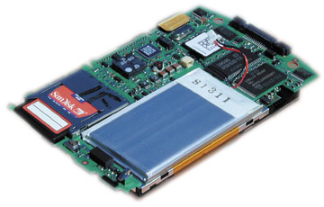
Because it is no longer glued shut, it only took a little searching on the Internet to find an extremely fragile Torx T4 screwdriver to take a peek beneath the shells (to save you the time: www.micro-tools.com). Very impressive. Both the m500 and m505 look remarkably similar inside. The battery is of the same shape, made of soft lithium polymer covered in a plastic material. It is perhaps a little thicker on the m505, and the motherboard is cut to fit around it. On the side you first see when you pop the back off are most of the chips that make the Palm what it is. The two largest are the Flash ROM (4MB, larger for the new OS) and RAM chips (8MB). Nearby is the serial chip; on the other side of the Universal connector is the USB chip. The Universal connector is indeed remarkably small as I was told by Andrea Johnson, Product Manager for the two Palm V progeny. Palm worked a lot with the vendor to make this part small and sturdy. One of the smaller chips is the 33MHz Dragonball VZ, and even smaller is the nearby Epson graphics controller, which Epson was careful to make the most beautiful chip on the board, polished to a near mirror finish.
I know this isn't of much interest to most of you, so I won't go on. I'm just really impressed with the tight and confident engineering I see in these two devices. Except for the two covers, nothing is locked in place once the back is removed as was common in previous Palms. It's all held firmly and precisely in place, though, when the covers are back together. Not a squeak. Not a rattle (except for that button array I mentioned earlier, but that's better free anyway). Impressive indeed.
Screens
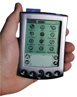
The m500 screen is excellent. Its pixels are slightly less black in sunlight when compared to a Palm V, but its background is considerably less green, more silver. Not as silver as the Visor Edge, but its pixels are blacker. It's not much different from the Palm V, which is a beautiful thing. Also like the V, the inverted backlight isn't so great in low light. In near dark, however, I can actually say that the m500's backlight is better than the Palm V. It's a lighter, brighter, greyish-greenish-yellow.
I like how Palm goes through the trouble to try to match the tone of the anodize on the body to the background of the screen, by the way. Both screens are more silver than previous screens, so the metal on the devices is more silver as well. The screen on the m505 is more silver than any monochrome screen.
Unfortunately, it's very difficult to comfortably view the m505's color screen a majority of the time. I've used mine a lot, and while I appreciate the technology and the difficulty inherent in shoehorning such advanced technology into this extremely slim device, the end result is not likely to be satisfactory to most. It is a reflective design, much like that seen in the Compaq iPaq and Sony CLIE N710C, designed to work both indoors and out. Owners of PDA's with traditional color TFT screens know that these screens are almost useless outdoors, but gorgeous indoors. The above two products achieve what is effectively a compromise between good indoor viewing and good outdoor viewing. Indoors, they light the reflective screen with a "frontlight" or "sidelight," as in the case of the iPaq. Both the Sony and Compaq pull this off reasonably well (many of those used to TFT's are still not satisfied, though the screens are generally useable). But there are a few more problems with Palm's implementation of the reflective, or HR-TFT, color screen.
First among the problems is that the frontlight does not come on automatically, and there's no option to make it do so. A few programs on the market will overcome this problem (EasyView, for example), but it could have been included in the OS.
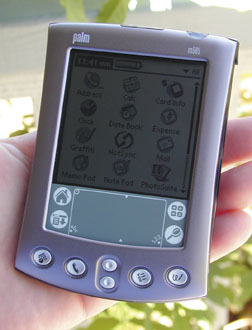
To try and summarize what I've learned through a lot of thought and testing: the frontlight on the m505 is of insufficient strength to be any help in most dim light. It is perfectly tuned to direct sunlight, but even in sunlight, if light is not falling directly on the screen and reflecting back to the user at the correct angle, viewing is difficult. According to Johnson, this is partly because the coating available for monochrome screens allows a greater variety of angles for light to enter and depart than any coating currently available for the m505's screen. It's a limitation of the technology.
But there's a bigger problem that's related to the coating. The frontlight is unable to overcome the ambient light one encounters in most shady or indoors situations because the coating is so dark. Instead, you're effectively left peering through this dark coating to capture very dim colors, hardly able to believe the frontlight is even on. This is not the case with the iPaq or Sony, which both use Sony screens, but have a similarly dark coating. We don't know who makes the Palm screen, nor do we know if it's possible to make it much better with existing technology without licensing it from Sony. But it seems like turning up the frontlight would help, if not solve, the problem. Yes, that would reduce the Palm's legendary long battery life, but giving users the option to have shorter battery life for a better experience overall seems like a smart compromise. After all, what good is it to have an unsatisfying user experience for a longer period of time? Give us the choice how bright we want the frontlight. They gave us that choice with the Palm IIIc's backlight, which usually only lasts for two weeks with regular use, less if you run it at its brightest, and it worked fine.
To see more on this issue and comparison shots between various Palm and Pocket PC devices, see my Screen Test at www.pencomputing.com/palm/stest/stest.html.
New OS
With many new, but mostly hidden features, the new Palm OS 4.0 makes its debut in the m500 series. The most noticeable feature may be its speed. Programs launch a little more quickly when compared to any other Palm OS device. Strangely, the machines do not benchmark higher, but Andrea Johnson assures me it's because "the benchmark program is making calls that OS 4.0 handles differently." Mr. Bridges, programmer of the Benchmark 2.0 program, disagrees. Regardless, for whatever reason performance is snappy even though the devices only score 154 compared to the 330 and Edge's score of 244.
The new device includes controls for its new hardware features, like the blinking light in the power button and the vibrate alarm. You can still set the unit to stay on in its cradle, and you can even set the computer to shut off after only 30 seconds; previous Palms gave the option of only one, two, or three minutes.
The calculator sports square buttons, but has no built-in scientific functions. In the new Date & Time category under Preferences, you're able to select a time zone and turn Daylight Savings Time on or off. From what I can tell, it doesn't switch automatically like Windows 9x. There is a Phone option included as a Preferences category. It becomes useful when you install the Mobile Internet Kit, allowing you to use many cell phones via an infrared or cable connection, depending on the phone. The Address Book has a dial option.
Alarms will now take you to the application that generated them by pressing the new Go To button, and programmers can now assign alarms to whatever they want. If you press Snooze on an alarm, you can go about what you're doing, but an asterisk icon will slowly flash in the upper left corner of the screen as a reminder. Tapping the icon takes you to that alert screen again and you can do as you please. Pressing Clear All ends the whole thing, or you can clear only one of multiple alarms that may be displayed. It would be nice if the alarm LED could be set to keep flashing as it does on the HandEra 330, but that it flashes at all, and vibrates as well, is a welcome improvement.
Security has been enhanced a little. You can now set the unit to lock at power down or after a specified period of time. You can even set it to lock at a specific time of day.
The onscreen keyboard has been improved to allow entry of Graffiti characters as well as tapping on the screen. This can prevent the need to switch to another keyboard to access a single number or punctuation character not included on a given keyboard.
I'm also pleased to report that Palm's Macintosh implementation is excellent. The first computer I HotSynced the m500 with was an iBook, and it went off without a hitch. Syncing with both a PC and Mac is also easy. Ain't USB great (finally)? And I don't know what they did, but HotSync is remarkably fast on either platform, faster than Visor. It's just like the old days when all we synced were a few phone numbers and appointments, only now we're syncing photos, documents, and multiple AvantGo channels.
Which brings me to the generous software bundle. Though an SD expansion card is not included in the box, you do get the Mobile Internet Kit, AOL for Palm (with email and Instant Messenger), AvantGo, Palm Reader (formerly Peanut Reader), DataViz Documents to Go 3, the Power One Personal Calculator, and MGI PhotoSuite Mobile Edition. It's a generous bundle, especially compared to past offerings.
Overall, the new m500's are worthy successors to the venerable Palm V and Vx, with the notable exception of the m505's screen. Those who work mostly outside and need a color screen should consider the m505, but I can't recommend it to anyone else unless they can see one in person and give it a thorough evaluation in several lighting situations. For the rest of us, the m500 is an excellent way to upgrade from the Palm V. It's lighter, HotSyncs faster, and has two excellent and forward-looking expansion options. The included screen covers are good, better than the Palm V covers because they have a leather hinge instead of rubber. Palm has cases for both products, some of which have slots for SD cards.
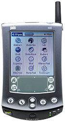
The true proof of the m500 series' usefulness will come as the other components of the system fall into place. We need wireless sleds, modem sleds, GPS sleds, all with pass-through ports for charging and using with a keyboard simultaneously. We need to see some of these cool SDIO cards, and we need programmers to tweak a few things here and there to make file access a little more like industry standard.
I look forward to the coming year as all these products emerge to flesh out what looks like it will be a great platform. It looks to be a minor upgrade now, but those ports are bristling with promise. -
-Shawn Barnett
Questions? Comments?
Back to Palm Section

